How to Make a Histogram and Frequency Polygon in Excel?
–
The Excel tool in Microsoft Office is not only useful for calculating by using functions and formulas, but you can also use it to generate graphs from data in tables. Such is the case with frequency polygons and histograms. In this post we will show you how to make a frequency histogram and polygon in Excel. Continue reading and see how to do it.
What is the procedure to make a histogram in Excel?
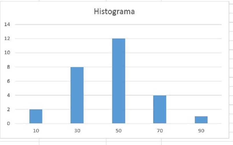
Before proceeding to run any graph such as histogram, it is necessary to make a table and organize the data correctly in Excel. Once you have your table with the data prepared, you can proceed to execute the histogram, for which it is recommended to do the following:
- Navigate the top menu of the Excel interface, and choose the “Insert” tab.
- Go to the “Insert column charts” tool and click on the icon.
- An empty graph will be displayed on your spreadsheet. Right click on the empty chart and choose “Select data” from the menu that is displayed.
- You will see that a pop-up window appears, you must click on “Add”.
- When you click on add, a pop-up box opens, where you must fill in some fields. The first one is “Series name”, you must enter the name of the series. In this case we will place Frequency histogram.
- And in the Series Values, you have to choose the range of values that you need to plot, for example, the absolute frequency is typically chosen.
- Click on accept once you have filled in the indicated fields.
- In the “Horizontal axis labels” proceed to edit the names that correspond to each column of the graph, for this you can choose the corresponding data range by clicking on the “Edit” button.
- Click on “OK” and voila, you will have your histogram.
Remember that another form or peculiarity of the histogram is the Pareto chart, and this is another resource that you can perform in Excel.
How to create a frequency polygon?
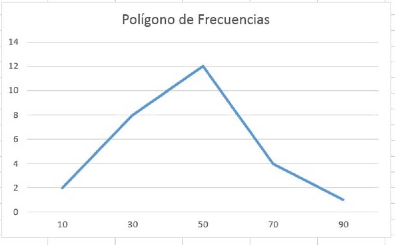
The way to get a frequency polygon in Excel it is very similar to the procedure for obtaining the histogram. However, the chart type changes from columns to lines. Here we show you:
- Navigate in the upper menu and choose “Insert”, go to the option “Insert line chart” and click on that icon.
- In the empty graph window that is generated, right click on the graph area and choose the option “Select data”.
- Click on “Add”.
- In the name of the series, place “Polygon of Frequencies”.
- In the “Series values” field, place the range of values you want to graph. Typically the “absolute frequency” is set.
- Edit the values of the horizontal axis by placing the values of the class intervals, and then click “OK”.
- To finish the process, click on “OK” and you will have your frequency polygon.
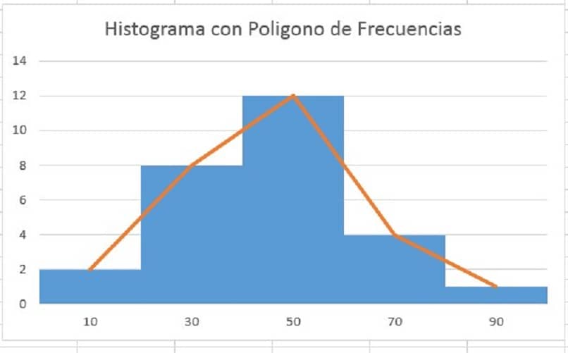
How to join the ends of the histogram bars to end the polygon?
Sometimes it will be very useful to have the frequency polygon and histogram graphs together in the same space or graphic. Furthermore, it will also be possible to take the ends of the bars of the histogram and join them together to form a polygon; follow the steps below to achieve it:
- You already know how to form a histogram, and this will be the starting point to join it to the frequency polygon.
- Click on the histogram graph area, right click and choose the “Select data” option.
- Click “Add” and add a new data series.
- In the name of the series put polygons of frequencies.
- In the field of “series values”, choose the same data with which you formed the histogram, that is, the absolute frequency.
- The result in the chart will be two series of columns with the same size. Now we proceed to convert the second series of columns into a frequency polygon.
- Click on the column of the series belonging to the polygon and navigate in the upper menu to “Insert”, choose the option “Insert line chart” and ready.
How to remove the space between bars from the chart?
Generally the histograms are formed by successive columns without spaces between them, so it will be convenient to know the process for remove the space that is created by default in graphs of this type. Pay attention and edit your chart:
- With the elaborated histogram, proceed to click on its area 2 times.
- A menu will open on the right side of the Excel interface.
- In data series format, in the menu “Serial options” Go to “Interval Width” and put zero “0” in the corresponding field.
- Press the “Enter” or “Enter” key and voila, the space between the bars of your chart will have disappeared.
Is it possible to add a title to the histogram and polygon when finished editing?
Excel will always allow you add information to your charts for its identification and you can do it by adding a text box, or by using the graph’s own interface. To place the title from the graph interface, follow the procedure below:
- Click on the graph area, and do click on the “+” symbol next to the graph.
- You will see that several options are displayed, check the ones that seem convenient to you to edit your graph. However, the most important and object of this section is “Title of the chart”.
- Edit the field information which pops up “Chart Title” typically placed at the top center of the chart and voila.
As you may have noticed, it is simple use excel to get the histograms and polygons of frequency that facilitate certain and certain studies. To expand the information we have given you, you can visit Microsoft’s official page and see how to create histograms in Excel, according to their recommendation. We hope the information we present you has been useful to you and we invite you to continue reading and see how to do it.
Related posts:
 How to access Steam games without an internet connection
  How to view FPS with Xbox Game Bar in Windows 10: Steps Made Easy
  Hacked account? How to check and remedy
  How to make video calls from WhatsApp Web
  How to increase the RAM memory of a desktop or laptop + Tips and Tricks
  How to organize your YouTube subscriptions into categories
+ Tips and Tricks
How to organize your YouTube subscriptions into categories
+ Tips and Tricks