Understanding past, forecast, graphical battery usage – Take a look at these tips, tricks, and solution you can use to make your life much easier with your devices whenever problems arrive and complications which you may find difficult to deal with.
The battery status of your Android is recorded in a history or graph that you can see in the Settings or General configuration of the device, option “Battery”.
It is important to learn to read or interpret what that history says, because it reveals very interesting information about the device, since the last time it was charged to 100%. This information is not only related to the battery, but to other aspects of the mobile: quality of the cellular signal in the last hours, statistics on the screen, Wi-Fi or GPS.
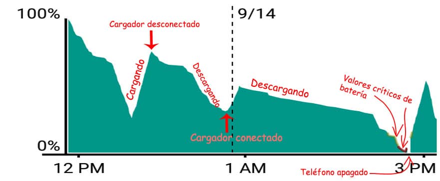
Most obvious is the graph in the upper half, which refers strictly to battery charge and usage. Here, uphill slopes (uphill or uphill) indicate that the device was charging and downhill slopes (downhill) indicate battery wear (device disconnected from charger).
In the first case, the most common is that the ascents are more or less regular from beginning to end. If there are severe biases, there is probably something going on during the upload process. The case of descents is more interesting and this can be the starting point to see why the battery lasts less: the faster the battery wears, the steeper the decline is going to be. In both cases, the information at the bottom can give an indication of what may be going on. This will be discussed later.
The graph may have sectors highlighted with a yellow and red line. The yellow line means that the device’s battery was below 10% charge, and the red line, that it was below 5% charge (as a short tip, don’t let the battery drain below 10 percent, because this can affect its life time). The absence of data on the graph means that the device was turned off.
And if you see gray filled sectors within the graph, these mean the battery time you have left (if the device is not plugged into the charger) or the time it will take to charge it (if it is plugged into the charger).
At the bottom of the screen, the “Mobile network signal” line indicates the amount of signal or the signal “bars”. Dark green indicates a good signal (all bars), light green means good signal, yellow little or weak signal (three bars or less) and red indicates that the device was searching for a signal (very bad for the battery). If it is empty, white or black here, it means that the device was in airplane mode, off, no signal or out of range.

In the case of Wi-Fi, it must be taken into account that the colored blocks indicate that this system was activated, regardless of whether the device was linked to a Wi-Fi network or not.
Be especially observant with the “Active” line, which represents applications that are “awake” consuming battery, even when the screen is off. This is normal for an application like Gmail, which must frequently check for new emails, but the color blocks should not be long, because this means prolonged and constant activity, therefore, continuous battery drain that must be controlled.
Regarding the “Screen on” line, remember that when you use your Android, what consumes the most battery is the screen (and the brighter, the worse).
Related posts:
 How to access Steam games without an internet connection
  How to view FPS with Xbox Game Bar in Windows 10: Steps Made Easy
  Hacked account? How to check and remedy
  How to make video calls from WhatsApp Web
  How to increase the RAM memory of a desktop or laptop + Tips and Tricks
  How to organize your YouTube subscriptions into categories
+ Tips and Tricks
How to organize your YouTube subscriptions into categories
+ Tips and Tricks